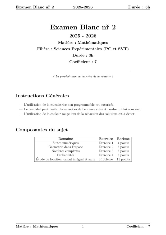
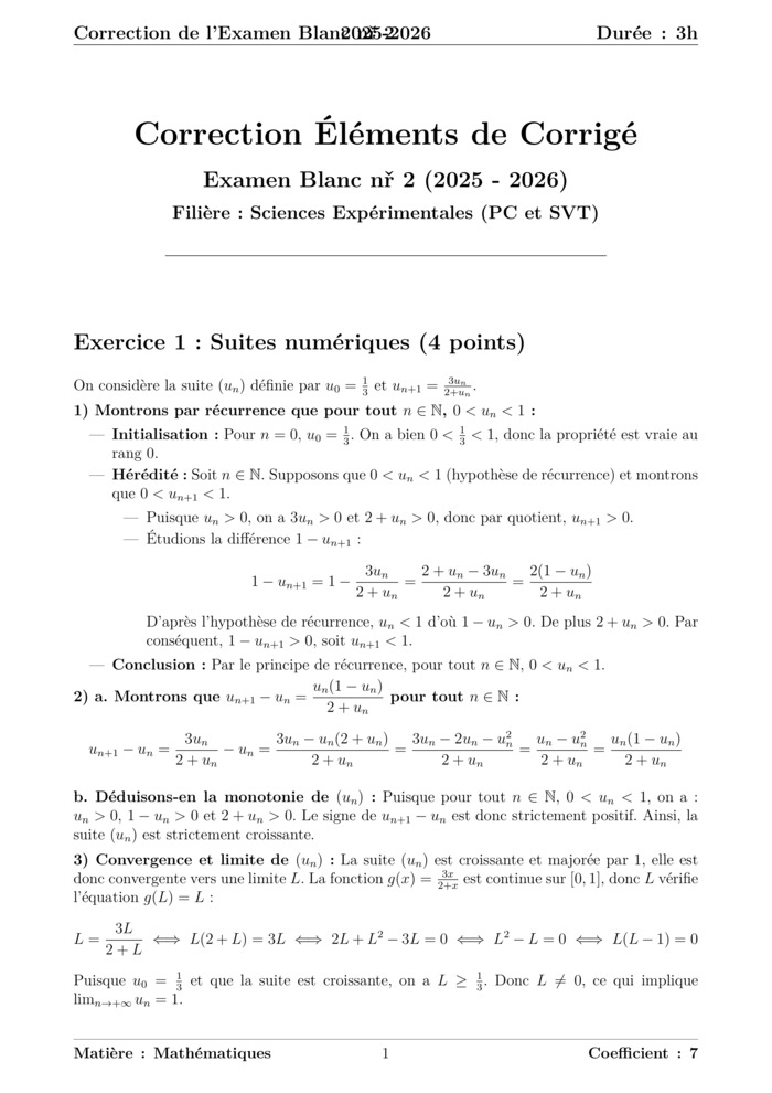
figure statistique en bars
📅 March 30, 2024 | 👁️ Views: 189
📄 What you'll find on this page:
• The Course PDF is embedded below — you can read and scroll through it directly without leaving the page.
• A direct download button is available at the bottom for offline access.
• You'll also discover related exams, courses, and exercises tailored to the same subject and level.
• The complete LaTeX source code is included below for learning or customization.
• Need your own materials professionally formatted? I offer a LaTeX typesetting service — send me your content and get a clean PDF + source file at a symbolic price.
📄 ماذا ستجد في هذه الصفحة:
• ملف الدرس بصيغة PDF معروض أدناه — يمكنك تصفحه والاطلاع عليه مباشرة دون الحاجة لتحميله.
• يتوفر زر تحميل مباشر في أسفل الصفحة للاحتفاظ بالملف على جهازك.
• ستجد أيضًا مجموعة من الامتحانات والدروس والتمارين المرتبطة بنفس الدرس لتعزيز فهمك.
• تم تضمين الكود الكامل بلغة LaTeX أسفل الصفحة لمن يرغب في التعديل عليه أو التعلم منه واستخدامه.
• هل تحتاج تنسيقًا احترافيًا لموادك الخاصة؟ أقدم خدمة كتابة LaTeX — أرسل محتواك واحصل على PDF نظيف وملف مصدر بسعر رمزي.
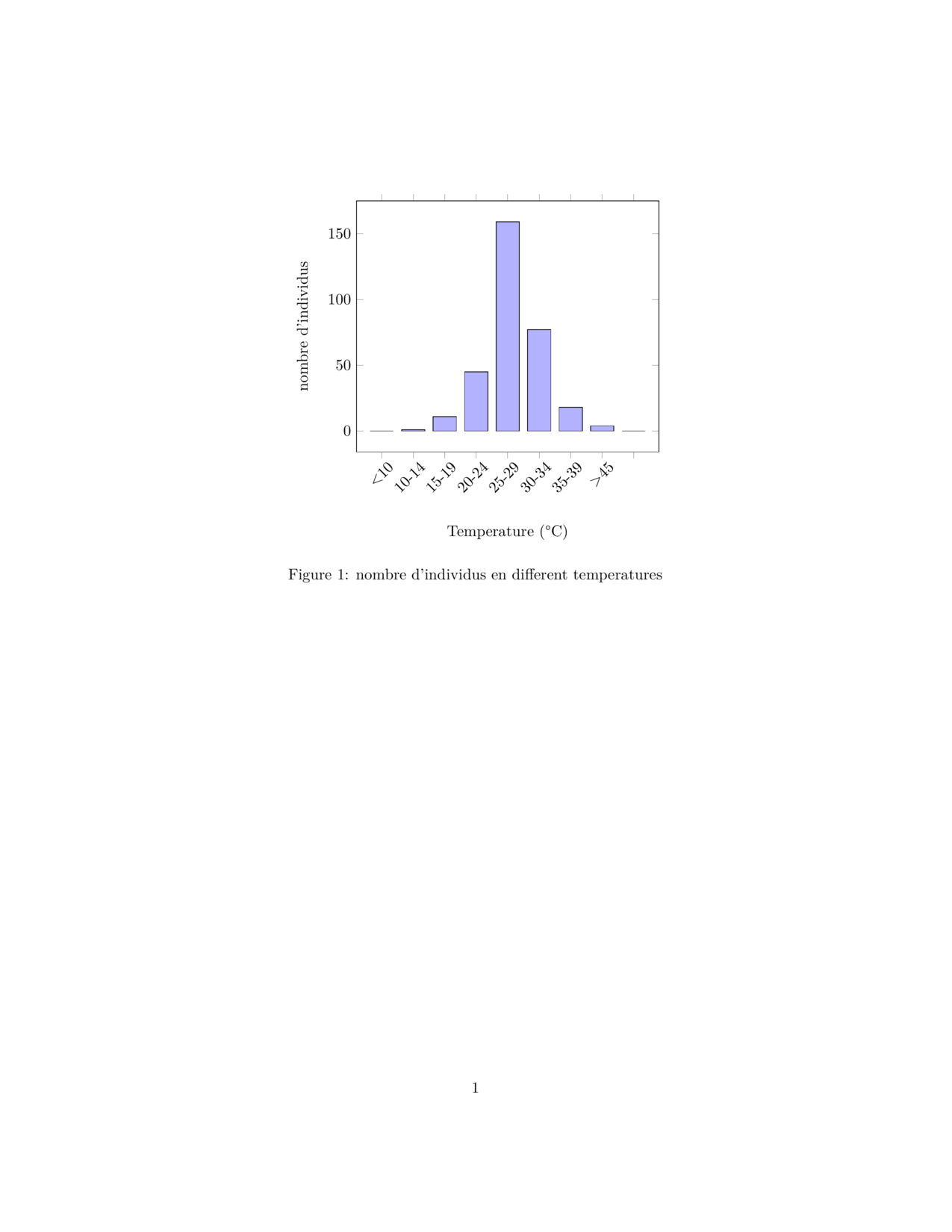
\documentclass{article}
\usepackage{pgfplots}

\begin{document}

\begin{figure}[h]
    \centering
    \begin{tikzpicture}
    \begin{axis}[
        ybar,
        bar width=15pt,
        xlabel={Temperature (°C)},
        ylabel={nombre d'individus},
        xtick={1,2,...,9},
        xticklabels={<10, 10-14, 15-19, 20-24, 25-29, 30-34, 35-39, >45},
        x tick label style={rotate=45, anchor=east, xshift=5pt, yshift=-7pt},
        xlabel style={yshift=-1cm},
        ]
        \addplot[fill=blue!30] coordinates {
            (1,0)
            (2,1)
            (3,11)
            (4,45)
            (5,159)
            (6,77)
            (7,18)
            (8,4)
            (9,0)
        };
    \end{axis}
    \end{tikzpicture}
    \caption{nombre d'individus en different temperatures}
    \label{fig:temperature_chart}
\end{figure}

\end{document}
✨ Get your own materials formatted with LaTeX
Explore more latex content for figures:
Related Courses, Exams, and Exercises
Frequently Asked Questions
What will I learn by the end of this course?
You will gain a solid understanding of Figures Statisitiques and be able to apply it in exams and real‑world problems.
What topics are covered in this course?
The course "Figures Statisitiques" covers key concepts of latex for figures. Designed to help students master the curriculum.
Is this course suitable for beginners?
Yes, the material is structured to be accessible while providing depth for advanced learners.
Are there exercises or practice problems?
Exercises are included to help you practice.
Does this course include solutions?
Solutions are available separately.
Download latex Course PDF (figures)
📄 Need LaTeX formatting?
Send me your homework, exam, or exercise content and I’ll turn it into a professional PDF.
Learn more →Recent Courses


Most Viewed Courses
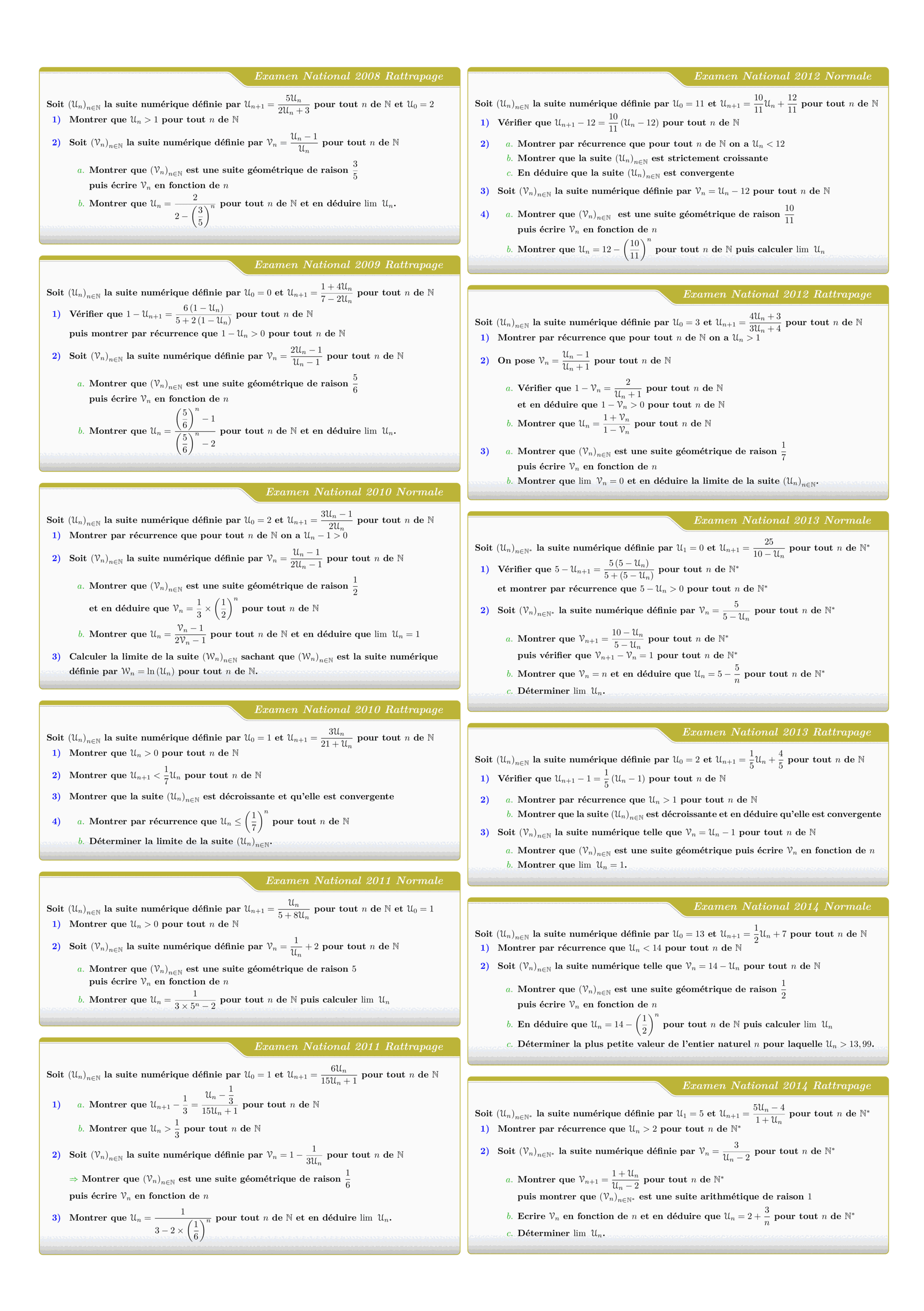
Tous les sujets des suites numériques des examens nationaux 2008 - 2022
Views: 2.99K
Exam • Maths • 2 Bac Science

Control 01 S01 En arithmétiques et Calcul vectoriel - A 2025-2026
Views: 1.90K
Exam • Maths • Tronc Commun Sciences
MATHEMATIQUES Examens nationaux 2003-2021 2 Bac.Sciences expérimentales
Views: 1.89K
Exam • Maths • 2 Bac Science
DM 1 - Arithmetiques, Calcul vectoriel et projection
Views: 1.82K
Exam • Maths • Tronc Commun Sciences
Recent Articles


Most Viewed Articles


The Ultimate Vim Setup (My 2024 vimrc ) : Essential Commands, Configurations, and Plugin Tips
Views: 1.33K
12 Apr 2024


Complete Tutorial: Creating Categories and Subcategories Using Pages in Pelican
Views: 1.02K
24 Jun 2025
Leave a comment